A NEW SPANISH COLONIAL REVIVAL
White stucco and red-clay roof tile are only the most familiar elements that represent the Spanish/Mediterranean style. To lead off the special Report on this vernacular house style, a Santa Barbara architect offers an in-depth look at his own contemporary interpretation.
By Thomas Bollay, AIA
 For more than a 100 years, Santa Barbara has been known for its Hispanic architecture. In the introduction to Spanish Colonial Revival in the first edition of Santa Barbara Architecture (1975), Herb Andree and Noel Young set the stage for this romantic style, “Spanish Colonial revival is really a catalog of styles, unified by the use of arches, courtyards, form as mass, plain wall surfaces, and tile roofs, all derived from the Mediterranean world. Designers were inspired by a number of sources: the adobe and colonial buildings of Monterey, California; late forms of Moorish architecture; medieval Spanish and Italian church architecture; Ultra-Baroque design of colonial Spain and Portugal; rural forms from Andalusia; Italian Romanesque and Renaissance revival elements”.
They went on to observe that, “This revival was a phenomenon which swept those regions of America with Hispanic pasts: California, New Mexico, southern Arizona, Florida, and Texas. In California this revival could be construed as a mature continuation of the Mission revival which had used Hispanic elements as mere dressing…heightened by the Spanish Colonial buildings in the 1915 San Diego Exposition.”
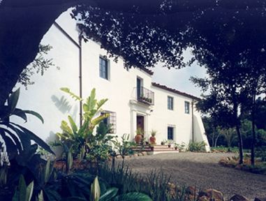
Casa de la Torre, a Case study
 Casa de la Torre is a homage to architects, George Washington Smith, Reginald Johnson, James Craig, Joe Plunkett, and Wallace Neff, who evolved this regional vernacular – the Spanish Colonial Revival style – during the 1920s and ’30s. Winner of an A.I.A . merit award, the Casa combines picturesque massing, thick stuccoed walls, tiled roofs, and a sparing use of classical detail.
My wife and I based our concepts for the design of our home from our travels through Spain and our fond memories of its romantic rural architecture. We took many photographs and made measured sketches of the buildings and gardens we visited. These images,and a close study of the buildings and original construction drawings of the 20s revivalist buildings located in Santa Barbara, created the basis for La Casa de la Torre. Our casa is approximately 3,000 sq. ft. and is organized along a simple plan with two primary axes. It is composed of a segmented rectangular mass along the south or street facade, off of which are an engaged tower and lower one-story form, creating definition for private gardens in the rear.
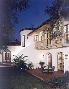
The major axis orients the living room and master bedroom north to a view of the mountains. The second axis is set off the first, to purposely opening the floor plan and embracing the small stone cottage (now my studio) and its gardens with the kitchen and dining terrace. An austere facade punctuated with deep recessed openings faces the street and is reminiscent of the many cortijos we visited in Andalusia. By contrast, the rear elevations have an abundance of large glazed openings which create plays of light and open the house to the garden.
 Our goal was to gracefully embody both tradition and modernity. With simple massing & traditional use of bright color set against white stuccoed walls , we strove to capture the flavor and romance of the Spanish countryside we so loved. In our living spaces, we sought to design a home that included current design concepts and highlighted the integration of indoor and outdoor spaces. Santa Barbarans live outside a great deal of the year, so our terraces must function as out-of-door living and dining areas. Rooms and their interconnections were designed to be picturesque, while at the same time responding to our modernist sensibilities. We minimized hallways, kept the room volumes simple and functional, and tried to let the sculpted forms and detail provide warmth and texture.
Concurrent with the designing of our home, I was asked to sit on the Montecito Board of Architectural Review with noted architectural historian David Gebhard. Over the course of the five years we were on the board, David and I became good friends, and he greatly influenced my approach to architectural design during our many bicycle rides in the hills behind Santa Barbara. From this friendship I learned a great deal about the history of the Ecole des Beaux Arts and how a 1920s Beaux Arts architect approached his / her design solutions. This knowledge along with my research into this wonderful style, has continued to gently influence my design today.
The essence of this style is in the proportion. Door openings have distinct vertical proportions, most French doors are either three or five lights and are usually 4 ft. wide pairs with a narrow 3 1/2 in. wide sash and a very simple square or beveled muntin profile. Windows are similar; casement pairs with a 2 1/2 in. wide sash, similar muntin profiles, and vertical proportions to those of the doors. Both typically open in, and are usually centered in the exterior wall thickness unless there is a desire for an interior niche or window seat.
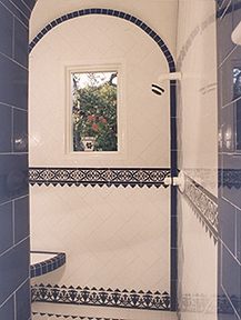
Tile floors are usually patterned with dark red tiles cut either from larger tiles or molded for the specific design. They are almost always bordered by a course of 6 in. x 12 in. tiles. Many patterns include fields tiles of olambrillas, which are brightly colored ceramic tiles used as inserts.
Fireplaces customarily have plaster surrounds and are relatively tall by today’s standards, usually 36 in. high x 48 in. wide, with tapered hoods that die to zero at the ceiling.
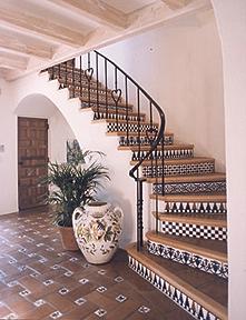 Hallway ceilings are often vaulted, and flat ceilings use larger than required beam sizes that are spaced much closer than usual- our contractor claimed he could drive a truck over our living room ceiling — 8 in. x 12 in. beams set 30 in. on center.
One of the features I struggled over for quite some time (but now seems obvious) was the selection of plumbing fixtures. My first thought was to try to restore used 1920s fixtures, but I later observed that the fixtures used in a 1920s Frank Lloyd Wright house were the same as those of a George Washington Smith Spanish Revival house of the same period; contemporary or revival, each architect wanted the most modern fixtures available at the time. Why not go with modern fixtures and let the hand painted ceramic tiles and rustic plaster walls evoke the Spanish influence?
Our roof tiles were cast locally from a Lincoln clay mixture. I specified that they be thicker than necessary to mimic the rough hand made tiles of Spain, but with a more rounded form to create added height and texture. We laid the pan tiles 1/3 off course, with the cap tiles laid evenly, which created a handsome undulation to the roof with moderate use of roofing cement between each tile. The first course of tile had random use of a starter tile, also creating an undulating uneven eave. Ridge tiles were set about 4 in. higher than the adjacent roof tiles and were laid in uneven lengths with white cement struck even with each tile.
Gutters were typically concealed or 5 in. half-round with mitered ends and downspouts with soldered segments at all bends.
Draft stopping and rodent proofing the double wood frame walls to meet current codes became a learning process. My solution was to first stand the exterior walls, then the interior walls and connect them at the plate line with 1/2 in. thick continuous plywood draft stopping. This method also greatly stiffens the walls and helps with squaring and alignment.
Thick walls that may at first be perceived as a waste of space add greatly to the romance, detail, and a sense of space in a room. Adding to that illusion are inset bookshelves, tiled window ledges, and fireplaces that are almost entirely captured by the walls’ thickness. These spaces also create great opportunities for locating wall registers or other mechanical elements where you prefer their location in the walls, not the floors or ceilings.
Published in Traditional Building magazine, January/February 1998
69A Seventh Avenue, Brooklyn, NY 11217